Monday, September 29, 2014

Week 6A


In Class:

These were 3 of the sketches we took away from all our doodles that we want to see a process in. Below is also the start of the one icon but it's a little too dark so we would need to touch up the brightness if I were to use those colors. 


Reading:

In this article it talks about the difference between flat design and skeuomorphism which is also know as realistic design. Each of these designs have pros and cons although can both look very clean and crisp. It all depends on the feel and emotion your trying to spark when deciding the style of your app icon should look. Skeuomorphism is more realistic because there are gradients and shading to add feature and volume to the design. Flat design on the other hand has been around for a long time since the swiss design era. Microsoft is trying to bring back this design. 


Week 5- Outside of Class

Posts from outside friends about Splitmate wireframe in app called Pop

Most of everyone I gave my app to and tried it said the flow was easy to understand and everything was easy to locate. Next to everyones name is the critique that I got from everyone.

1.) Derek Totaro-
Said the app was really cool but noticed that our link from calculator went to the                                               calendar page instead of the calculator.

2.) Alexandra Hartman-
Alex didn't like how there was only 3 buttons on the bottom navagation when it seems like there should be 5 buttons. She also thought it was thought out and there was no hiccups or confusion to which page she was on.

3.) Gabi Forney-
One thing Gabi didn't like that if the app had all this important information then why wasn't there a re-sign in page even if you were already a member. ** I had never thought about this and thought it was be smart to add this page into our app**

4.) Rachel Wilson-
One area where Rachel got confused because she thought the little icon in the top right corner was a way to write a message instead of thinking you could edit this page. **During our research we saw both examples used in different ways, so I guess when we design our icons we have to keep this in mind**

6.) Alex Aberrnat-
Because of all the changes that were made during each persons Alex couldn't have a say on the app because he didn't notice any errors.

Readings

"Hollow Icons" - www.medium.com

The purpose of this article is to look at hollowed out icons that are simply just lines and comparing it to other icons that are all filled in. This article believes the hollow lines make the user tired even though it fits the constrains of the phone design. In the new IOS 7 we see a lot more hollow designs and someone people really love it and other do not. To argue how this design is not the best is because our brain registers each line and take more time where if you were to outline are solid shape we can look at it as a shape instead of tons of lines and trying to figure out what it means together. The only thing about the hollow shapes is that it just takes the brain longer to process.

"Geon Theory" - IID Book

The Geon theory states that we recognize and break down objects we see into a basic group of shapes. This theory can also be called recognition by components. By using recognizable shapes the viewer can think about what the  object is rather than what it looks like. Three different examples are icons, pictogram and isotype icons. Icons simply are abstract symbols to represent a function or process. A pictogram represents images that are used in place of words or phrases to communicate it's meaning. And lastly a isotype is a well known system used in Europe.

Icon Sketches 

All of the icons we had to create can be interpreted in many ways which is why I drew several different examples for each. I drew both icons and logos.


Marc's Sketches


Detailed Wireframe and Flowchart Path

My job was just to create the detail wire frames for the register page and signing in.


Marc's Wire frames


Flowchart:

We need to work on our flowchart more so there are less arrows and lines. We were unclear about this part but now know we need direct routes of how to get to each screen


Sunday, September 28, 2014

Week 5- Outside of Class: OFF CAMPUS EVENT

Off Campus Event

JPL (Integrated Communications, Inc) in Harrisburg, PA.

            On Friday morning September 26th a group of Millersville Students were able to get a tour of JPL’s facility by the Human Resources Director. Before arriving at JPL I thought it was a marketing group that helped promote businesses and provide them with branding and marketing tactics to better their company. JPL started off as video production company and has moved their company into a more integrated communications company where they are experienced in all aspects from video productions, branding, motion graphics, recording, design, event, publications, marketing, e-learning, interactive design that deals with web development and so much more. JPL can build a company from the ground up to get it running. On our tour we were able to talk to most of the departments. This was nice because we got to see what projects they have completed and were working on currently.

            Starting off of the tour I thought how interesting this place would be to work at and how relaxed the environment was. But I wasn’t fond of the layout much. Every department was split up and everyone was stuck in a cubical. And most of the cubical were completely empty. This seemed very stand off to me. Personally I thought if this company was truly integrated that there would be more common meeting rooms and more people from other departments would be collaborating with one another. Maybe it was just an off day but the departments seemed very segregated and no one was communicating.  What really made me upset about this company was the Human Resources director who didn’t seem very knowledgeable about JPL and what exactly each department did. Instead of her talking about what department did she tried to find someone who was available to speak on there own projects. She seemed very unprofessional to me because her purple lace thong keep on popping out and her torn jeans were very inappropriate for someone giving a tour of the company to potential interns and clients. Upon our arrival she knew we were graphic and interactive design students so she touched base on how to get an internship with JPL and made it seem impossible which kind of offended most students because she hadn’t seen any of our work. I was a little annoyed with the Human Resources Director because she knew that we were all design and interactive students and she didn’t bring us to talk to any of the graphic designers.

            I wish she had brought us to talk to the actual designers so we got to see exactly what they were doing. I could have cared less if we got to talk with the e-learning group. The only part I liked about the tour was when we got to talk with Professor Nancy Mata’s fellow student who graduated from Millersville University. She was a graphic designer just like most of us who integrated her way into the front-end development department where she worked with a lot of the front-end and back end developers. She showed us one of the projects that she worked on as a designer and it was set up on this cool station full of all different laptops, tablets, and phones that have been synced to pull of the same webpage and show the different layouts and how they would appear on that screen.  This appealed to me because most of my interests are in the front-end development field because you can be a designer but learn the code that follows with it.


            Overall I took a decent amount of information away because if it weren’t for the human resources director I would have had a better time. I plan on applying to JPL as a possible internship but wouldn’t make it my first choice because I know there are similar companies like JPL.

Wednesday, September 24, 2014

Week 5B

In Class:

We met with other classmates in our class and had them test our app and give us feedback on functions that weren't working and how to refine our app.

1.) Roy & Laura
             They said to make the sign in form (swipe function) larger in term of height. Right now we only have the swiping feature at the bottom of the page and I didn't think about where your thumb is on the phone and it actually reaches up higher on the phone than just the bottom. By adjusting the height of the swipe feature it fixes that issue.

2.) Jeanna & Noah
               Said it was a little confusing between the profile and home page but its mostly because of the pencil drawings but by changing the color of the page or design could help with this issues. Over all they said our app worked smoothly and if they had to pick one thing it would be the > arrow function next to roommate info on the profile page. If we had a box around the arrow instead of the content people may understand that better.

3.) Josh & Ashley
              Some concerns this group had with our project is being able to swipe back in the register page because you are only allow to move forward, so if you had a mistake then your able to go back and edit the previous page. They also said our content flow was easy to follow and the loading page was a nice touch.

4.) Professor Notes
             Our teacher said to rethink our homepage because the photo isn't necessary because you know it's you using the app and thats what profiles are for.

Tuesday, September 23, 2014

Week 5A

Reading: 
Building Clickthrough Prototypes To Support Participatory Design
www.smashingmagazine.com

The beginning of the reading talks about prototyping and the importance of mapping out your app because it will fall short with small links and technical problems. High Fidelity is not the answer because you become so in the moment of design instead of making sure the user experience is answered. Having click through prototypes is the best way because it gives a user the chance to make sure they can get to each page that they want to without being confused. Clear paths are links will make it become a success. Before the prototyping process you must sketch out all your ideas to capture the best solutions. From the sketches become paper wireframes and then the wireframes become photos that you can take to place on to your phone and manually give the boxes that are on paper a gesture as if it were a working app. Pop is an app to let you do this type of prototyping of link pages to one another to make it seem like your using an app. As with all app there are pros and cons.

In Class: 

Today in class we worked on refining our prototype wireframes. We mostly spent the whole class reworking this concept because we wanted to make sure all questions were answer and it would be easy to go from point A to point B. We worked out most of  our issues like the redundancy and seeing what buttons and function were necessary. We proved our point with the side navigation bar that it would be necessary to hold our secondary information because it sort of like the Facebook app where everything that isn't located on the main page of the app goes into the navigation bar or hamburger.

Images below are the refined version of our prototyping.


The next images are our prototyping on paper app. The app is called POP and it allows you to take photos of the images and set links and gestures on top of the content in the photo to be able to use it if it were a real app. I had a lot of fun using this because it was nice to see our product in actual use and see the issues we would have when trying to get from page to page. 


Some errors I found were making sure they linked to the correct page. Because we didn't get anyone in our class to try out the app yet we would try and squeeze it in next class. 

I had one person outside of the class use it and they made me rethink the sign in page. For example you need to be able to swipe right and left to go forward and backwards to get to each page. Also a major thing they noticed was your not actually swiping right to move right. You have to swipe left to move right and I didn't think about that when I was placing the functions in the app. 


Monday, September 22, 2014

Week 4- Outside of Class

Readings:

IID Book:

Controls- Are used within interfaces to allow the user to change adjust or manipulate the interface content. Some examples are action based, selection based, input based and display based. Each one has a different function.


Design Constraints- Design Constraints help form the scope of the project and if you don't follow the constraints then you may run into bad design or higher project costs. For example using two ink colors over 10 will make your site cheaper.

Design Patterns- Are the patterns of the site that go beyond style and visual repetition. But they are the solutions that have a working function to better the functionality of the user experience.

Multi-Touch Gestures- Some gestures that you use with your hands operate and move function of the screen using touch are tapping, pressing/holding, scrolling, pinch (zoom in/out), swipe and rotate.

Wireframes- Is an example of prototyping by using what looks like a blueprint to show content hierarchy rather than styling the elements.

Mobile First

Chapter 4- Organization-   This chapter talked about how organizing your content and placement of each section can affect where and when personas view the app. If they are trying to get from A to B but C is bigger in hierarchy then the user will go to C and mess up the whole process. Hierarchy of information really becomes important as well as the colors that are either matched and or contrasting. This chapter all talked about the function and some phones by not have the same functions as another phone so you need to know the target audience your appealing for.


Chapter 5- Actions- This chapter talked about the reach function of the user if they are using multiple fingers or just one. This also depends if the user is right or left handed. They talk about all the different functions you can do with your fingers with either two hands or just one hand. It's smart to map out what functions will happen in your site or it will become to busy and hand demanding.


Medium.com


What's in your pencil case? - This article talks about how sketching is important because you come up with more design ideas rather than going start onto the web. You are more flexible when it comes to pen and paper rather than the web. But if you have a good idea on paper and aren't sure how to produce it on to the web then you can make changes. It also allows you to see the wrong designs before diving too deep into your app design. It goes over how the design on paper do not have to be beautiful it just has to be clear. For example the little text doesn't need to be written out letter by letter it can just have a placeholder of lines to show the viewer giving you feedback that there will be content in that place.


Content:

This is the information of what will be on each page of the app


Log in/Register Screen

Register Screen
Series of pages that have a next (action) function and will end with a submit button to activate
Screen name/email/password
Honesty Act
Basic Demographic info
Select how many roommates
Sync roommate screennames


Home:


Profile Photo
Name/amount due for month
Roommates and amount they owe


Personal Profile:


Photo
Name/info
Total amount due for month
Rent cost
Utilities cost


Calendar:


Dates represented with calendar
Current date
Date rent is due
Set reminders


Settings:


Edit Info
Calendar Settings
Edit Roomates
Notification Settings


Roommate Profile:


Name/Info/Pic
Total Amount they owe this month
Rent Cost
Utilities Cost
Send personal reminders
Amount they owe you, Amount you owe them


Wireframes

This portion of the project is all about prototyping and drawing out what you believe the app will look like and see if what your drawing is really mapping out to the next page and your capable of getting to the previous page by using the back function or using the navigation bar or also known as the hamburger. 


Wireframes that I made: (mostly the register page and a little of the app)


Wireframes that Marc made:

Week 4B

Today was primarily a work day because our professor was not there due to a field trip but this gave the class a lot of time to start working on our homework come monday. In class my partner and I split the work of finding Design Patterns that appealed to us. We both had the same idea of how our app will look like there is just a few variations of the style of apps we choose. The first image is the one's marc completed and the second image are my design patterns. 

This took up most of our time in class because I was trying to familiarize myself with InDesign again. 


Week 4A

In today's class we used this time to go over our group's flowchart and personas. So changes we need to make were getting rid of unnecessary content that would of made our app overwhelming on the main page and only kept what was most important. The homepage now only has button to direct you to (rent/utility) info, the calendar and roommate profiles as well as your own. We also minimized the amount of info you need to fill out when you register into the app because there was just too many questions that someone may not know at the time of applying.


Monday, September 15, 2014

Week 3- Outside of Class

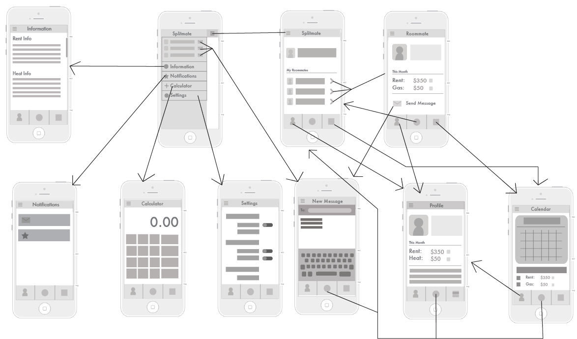
Outside of Class my group split up the work, we both worked on the personas and the flowcharts/site maps. In the articles we read it talked about the difference between flow charts and site maps and how in flowcharts you have a decision making process where site maps are more broad and give you several options we choosing we direction you want to follow in the map. In the images below are flowcharts expect for the first image where its a hybrid of both types.

(Describes users who have been the app and are checking on sections within the app)

 (This is the flowchart that describes first time login user and how to register.)


Personas #1
Description: Macintosh HD:Users:samboo86:Documents:School 2014-2015:Intro to Experience and Interactive Design:collage-students.jpg
Demographics
Name: Beth White
Age: 20
Occupation: Undergraduate Student
Location: Altoona, PA.

“ I hate dealing with paper work and I never seem to have a pen and paper on me.”

Goals
-       Being able to have an app to keep track of bills
-       Keep in touch with roommates when verbal communication isn’t there
-       Access roommates parents and contact them easily
-       Settle arguments with bills and dividing them evenly

Behaviors
-       Motivated
-       Slightly unorganized
-       Introverted person
-       Don’t like disputes

User Behavior
-       Needs to find information quickly
-       Doesn’t like to many pages
-       Clean simple designs
-       Hates apps that only allow you to previous pages and not any page you want
-       Don’t like advertisements


Description: Macintosh HD:Users:samboo86:Documents:School 2014-2015:Intro to Experience and Interactive Design:Businessman-with-piggy-bank.jpg
Personas #2

Demographics
Name: Frank Longcart
Age: 25
Occupation: Management
Location: Philadelphia, PA.

“I need an app to help me commutate with my cregg’s list roommates”

Goals
-       Being able to keep in touch with roommates that I never see personally
-       Settle arguments and dividing bills evenly
-       Stay organized
-       Allow alerts to keep the bills on track so they don’t become late

Behaviors
-       Organized
-       Busy throughout the day
-       Extraverted
-       Don’t like disputes

User Behaviors
-       Easily Distracted by too many functions
-       Being able to link and share information on applications
-       Being able to send notifications
-       Need fast loading apps to keep up with my busy schedule
-       Clean Designs


** These are the personas that Marc completed 

CollegeKid081109.jpg
Rich
Demographics:
Age 20
Occupation: Student, with apartment
Location: Millersville, PA


Goals: wants an app to help organize bills, wants to be reminded when bills are due


Behaviors: lazy, disorganized, doesn’t communicate with roommates too well


User Behaviors: can operate phone and technology with ease
Amandapatricia_weitz.jpg
Demographics:
Age 23
Occupation: Student, with off campus house
Location: Towson, MD


Goals: wants app to keep herself and roommates on top of bills


Behaviors: orderly, friendly, studious, talkative

User Behaviors: can pick up info quickly and operate apps easily