Most of everyone I gave my app to and tried it said the flow was easy to understand and everything was easy to locate. Next to everyones name is the critique that I got from everyone.
1.) Derek Totaro-
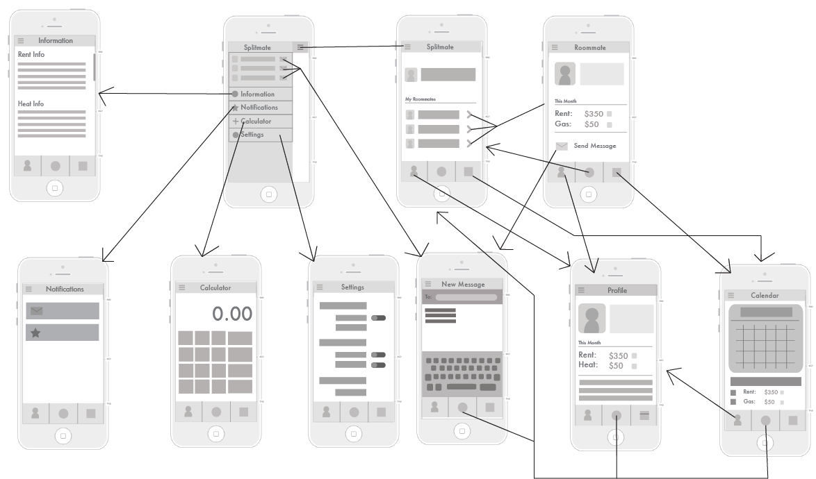
Said the app was really cool but noticed that our link from calculator went to the calendar page instead of the calculator.
2.) Alexandra Hartman-
Alex didn't like how there was only 3 buttons on the bottom navagation when it seems like there should be 5 buttons. She also thought it was thought out and there was no hiccups or confusion to which page she was on.
3.) Gabi Forney-
One thing Gabi didn't like that if the app had all this important information then why wasn't there a re-sign in page even if you were already a member. ** I had never thought about this and thought it was be smart to add this page into our app**
4.) Rachel Wilson-
One area where Rachel got confused because she thought the little icon in the top right corner was a way to write a message instead of thinking you could edit this page. **During our research we saw both examples used in different ways, so I guess when we design our icons we have to keep this in mind**
6.) Alex Aberrnat-
Because of all the changes that were made during each persons Alex couldn't have a say on the app because he didn't notice any errors.
Readings
"Hollow Icons" - www.medium.com
The purpose of this article is to look at hollowed out icons that are simply just lines and comparing it to other icons that are all filled in. This article believes the hollow lines make the user tired even though it fits the constrains of the phone design. In the new IOS 7 we see a lot more hollow designs and someone people really love it and other do not. To argue how this design is not the best is because our brain registers each line and take more time where if you were to outline are solid shape we can look at it as a shape instead of tons of lines and trying to figure out what it means together. The only thing about the hollow shapes is that it just takes the brain longer to process.
"Geon Theory" - IID Book
The Geon theory states that we recognize and break down objects we see into a basic group of shapes. This theory can also be called recognition by components. By using recognizable shapes the viewer can think about what the object is rather than what it looks like. Three different examples are icons, pictogram and isotype icons. Icons simply are abstract symbols to represent a function or process. A pictogram represents images that are used in place of words or phrases to communicate it's meaning. And lastly a isotype is a well known system used in Europe.
Icon Sketches
All of the icons we had to create can be interpreted in many ways which is why I drew several different examples for each. I drew both icons and logos.

Marc's Sketches

Detailed Wireframe and Flowchart Path
My job was just to create the detail wire frames for the register page and signing in.

Marc's Wire frames


Flowchart:
We need to work on our flowchart more so there are less arrows and lines. We were unclear about this part but now know we need direct routes of how to get to each screen
No comments:
Post a Comment